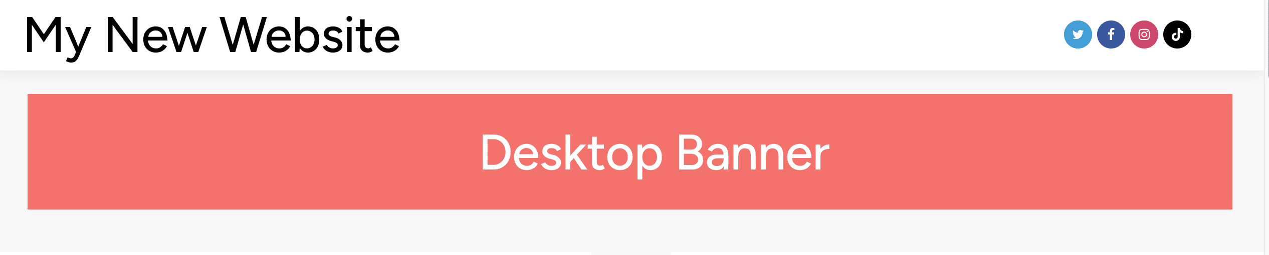
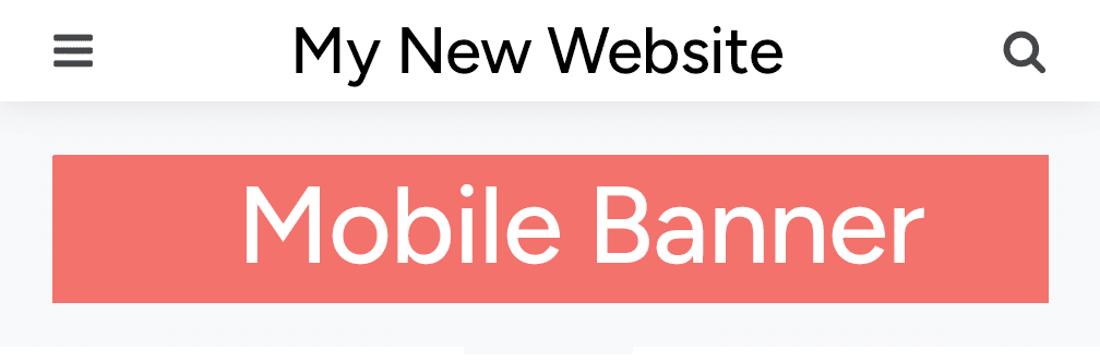
I’m redesigning one of my sites and will be adding Google Adsense code. For one of the banner placements, I want the site to automatically show by loading the code to display the wider banner if the user is using a desktop device. And, if the user is using a mobile device, I want the site to load the code to display a banner that is narrower & taller.
Like this:
The theme I am using, gives me a spot to add “code”. This meant that I can use HTML, CSS and JavaScript.
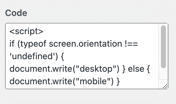
After doing some digging around, I found the simplest, yet sophisticated, approach to make this work using “typeof screen.orientation”.
Here’s how to implement it:
if (typeof screen.orientation !== 'undefined') {
   document.write("Desktop Code Here");
} else {
   document.write("Mobile Code Here");
}
The final step is to replace the “Deskop/Mobile Code Here” with your actual Google Adsense Javascript and thats it.
I hope this helps you.
Leave a Reply